Google UX Case Study
Introduction
The main objective of this project was to ultimately propose and showcase solutions to an application. In my case, this was the mobile version of Google Maps.
Course: User Experience (TWC 544)
Programs Used: Adobe InDesign, Microsoft Word

Google Reviews
Before putting together a case study, I first needed to gather primary research information to base my user experience changes on.
For a proper baseline and consistency, I visited the Google Play Store and looked at 50 reviews made over one month. At the time of my project, these reviews were posted approximately 30 days or less. I wanted to make sure whatever issues these customers were facing, that I was following the most recently updated version.
Out of those user reviews, I wrote down a one or two word summary of the positive and negative aspects of their experience.
Design Comps
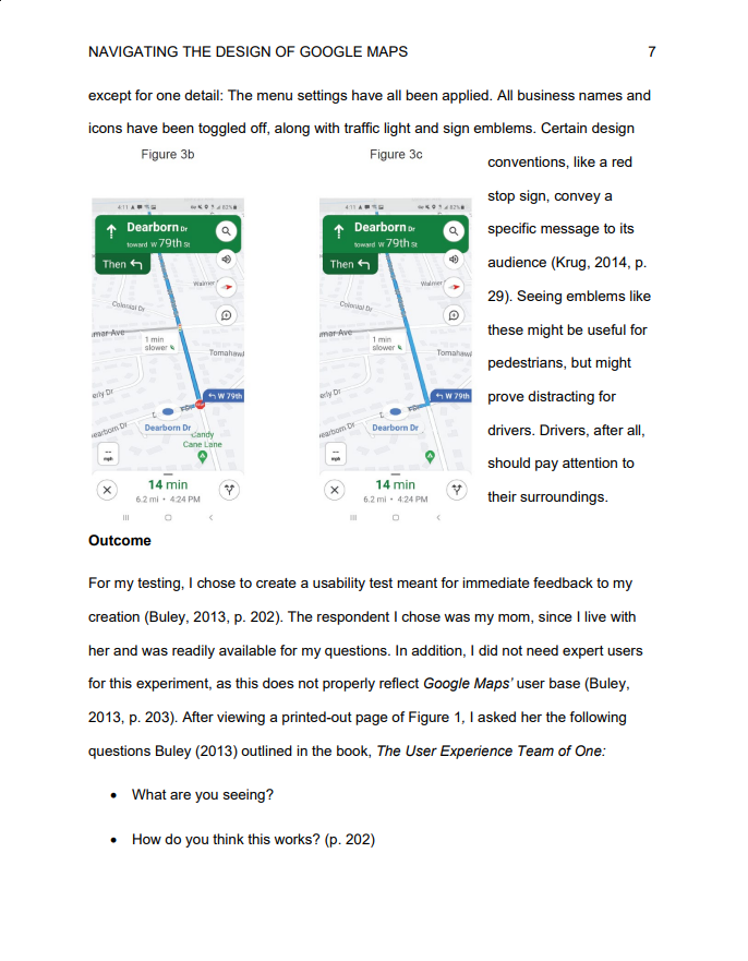
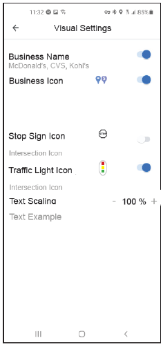
A common complaint I found in my research was a lack of visual clarity.
As demonstrated by this design comp to the right, I gave users the option to increase the text scaling to 150% of its original size.
Going over 150% would overcrowd the screen. Given how many millions of people have used Google Maps, I found it inexcusable for such a basic option to be absent in the real-life application.
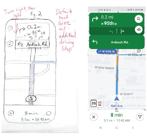
The figures to the left are additional images showcase one of my sketches, as well as the resulting design comp I ended up with.