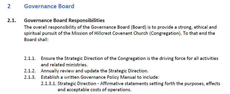
Governance Policy Revision
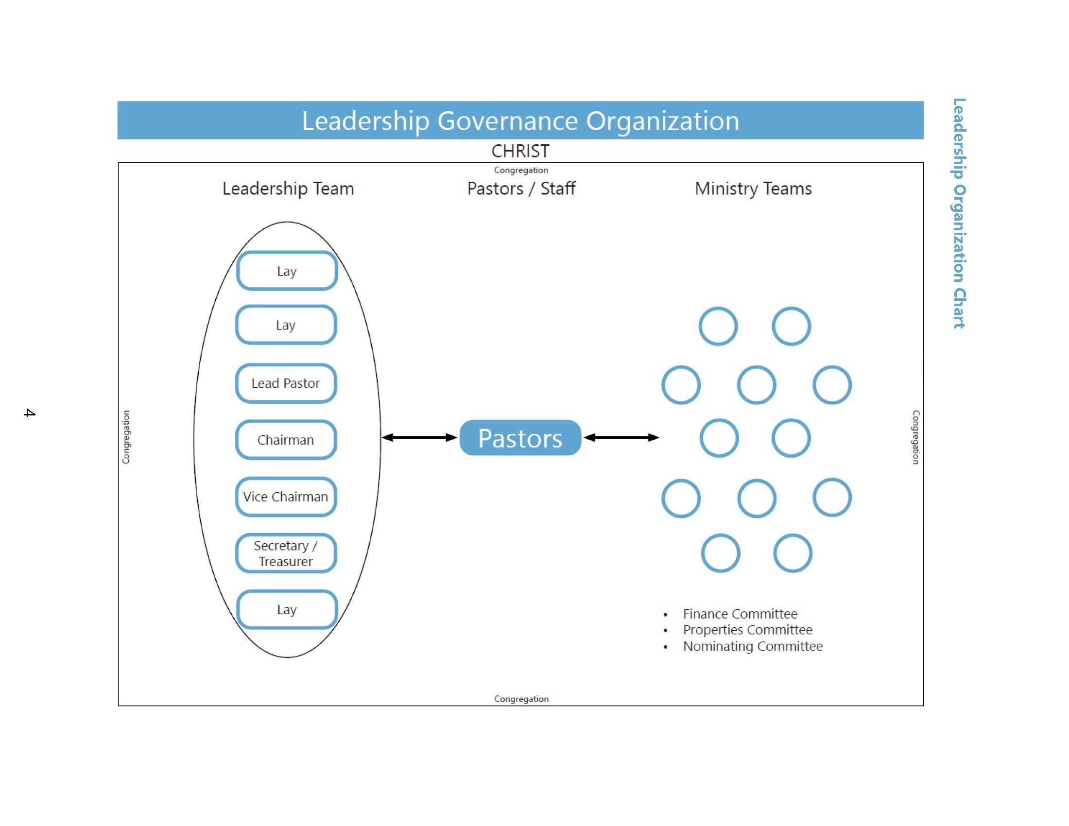
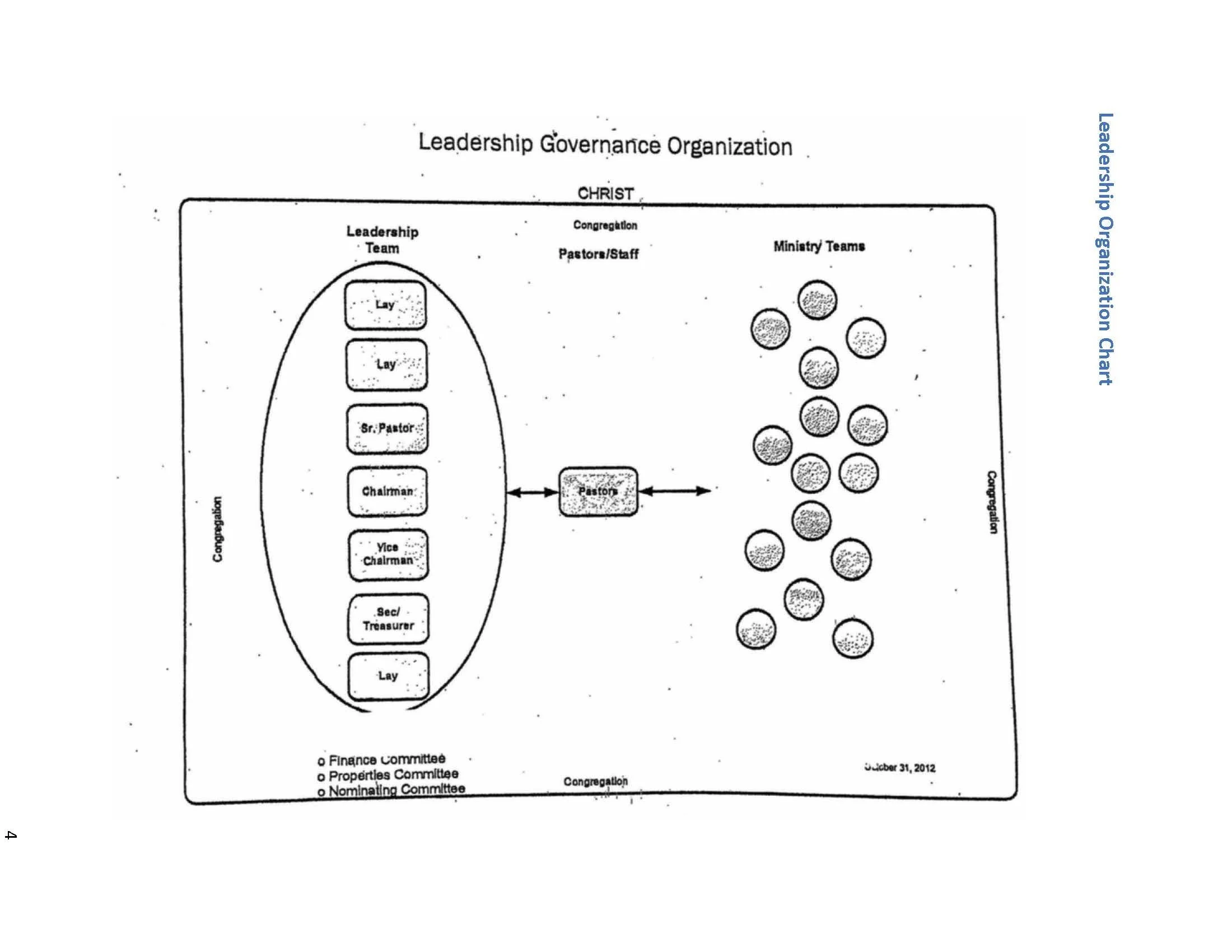
The intention of this picture was illustrating the church’s leadership structure and support network. It reflects their commitment to each other, as well as their faith overall. However, the original graphic seemed to have been scanned half a dozen times in black and white, ruining any semblance of visual clarity.
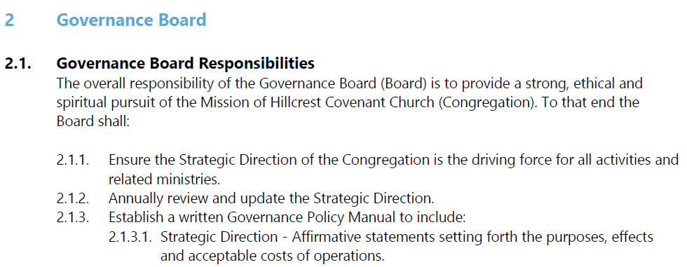
Since this was a revision, and not a complete redesign, I couldn’t deviate from the overall message. Like the title page, I incorporated the existing color scheme set by the church’s logo – primarily the light blue, as it looked good on the white background.
Color Scheme and Design
Introduction
In one of my course finals, I chose to rework the governance policy for a local church. I maintained email correspondence with the senior pastor, keeping him updated on the various changes I made.
Client: Hillcrest Covenant Church
Course: Principles of Tech Editing (TWC 531)
Font Type and Spacing
Given that this project would primarily be read online, I knew the document would work best with a sans-serif font style.
The original version had Calibri, which is the default font for Microsoft Word. I instead chose Segoe UI, maintaining the tone and style of the overall document while still giving it a clean look. When appropriate, I also made sure to space the text out in a more uniform manner. External business documents like these represent the organization, so first impressions are crucial.
Something as simple as a missed indentation or the wrong line spacing can turn off the reader’s interest.
Infographic
Any professional organization should have design consistency across all pieces of media. Whether it be pamphlets, presentations, or documents, there needs to be an impression of uniformity. Otherwise, audience members might think a certain company is under chaotic and disorganized leadership.
My main inspiration for these revisions came from Hillcrest’s annual report. While the color scheme differs slightly, the title page makes it pretty apparent how closely I followed an existing document’s formatting. The church’s leadership team is the primary audience for this document - so design congruence is key. I’m proud of my work, and Adobe InDesign gave me the tools to really pull it off with style.